Furniture Catalog: Brand Identity Development
For this catalog project, I created a full brand identity for my chosen company. This included researching the company name and designing a complete logo system (primary, secondary, and submark). I developed a mood board to define the visual direction, selected colors and fonts with clear rationale, and identified the target market. I also wrote a concise pitch to communicate the company’s mission, tone, and unique value. All content was produced in both English and French to reflect the bilingual nature of the assignment.
LOGO
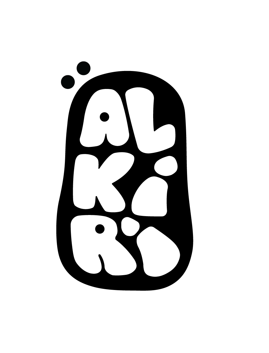
The Alkiri Home logo was designed to reflect the brand’s focus on warm, modern, and nature-inspired interior design. The customized typography blends elegant serif curves with bold geometric forms, giving the logo a refined yet contemporary look. A subtle branch-like element is integrated into the letter “K”, symbolizing growth, craftsmanship, and the organic materials often used in the brand’s furniture and decor. The logo system includes a primary wordmark, a secondary condensed version, and a circular submark featuring the initials A.H for versatile use across the catalog. The warm neutral color palette enhances the sense of comfort and simplicity, aligning with Alkiri Home’s mission to create inviting, stylish living spaces.

PALETTE

A light, airy neutral that brightens the layout and sets a calm foundation.
Soft Cream creates an inviting, minimalist atmosphere.

A gentle beige that adds warmth and softness without overwhelming the design.
It grounds the visuals while keeping a cozy, natural feel.

An earthy muted green inspired by natural fabrics and foliage.
It introduces subtle color while staying true to the brand’s organic aesthetic.

A rich, wood-toned brown reflecting craftsmanship and timeless furniture materials.
It adds depth and reinforces the natural, durable character of the brand.

A refined dark hue used for text and contrast elements.
It ensures clarity, sophistication, and a polished modern look.
CATALOG
For my catalog layout, I kept everything clean, minimal, and easy to follow. I used soft neutral backgrounds and consistent spacing so the pages feel calm and organized, and each section starts with a full-page image to set the mood before showing the products. On the product pages, I followed a simple grid that pairs the photos with short bilingual descriptions, prices, and dimensions to make everything quick to read. The color palette and typography stay consistent throughout, which helps keep the whole catalog cohesive and reflects the warm, nature-inspired vibe of Alkiri Home.
Brand Implementation
For the mockups, I wanted to show how the Alkiri Home brand would look in real-life applications. I created a shopping bag mockup using the AH submark to highlight how the logo works on packaging and retail materials. I also made a business card mockup placed on a wooden chair to reflect the brand’s warm, natural aesthetic. These mockups help visualize the identity in a professional and realistic way, giving a better sense of how the brand would appear in everyday use.
TYPOGRAPHY
For my headers, I chose Trade Gothic Next LT Pro Bold Condensed because it gives the catalog a strong, modern, and structured presence. The condensed style keeps the titles bold without taking up too much space, allowing the layout to stay clean and minimal. This typeface helps anchor each section and guides the reader naturally through the catalog while matching the sleek, contemporary feel of Alkiri Home.
For my sub-headings, I used Mundial Narrow Variable Bold, which creates a clear hierarchy between the main header and the body content. Its bold weight adds emphasis, but the narrow shape keeps everything neat and balanced on the page. This typeface works well to highlight important details and acts as a smooth visual transition within the layout.
For the body text, I selected Mundial Narrow Variable Extra Light to keep the catalog feeling airy, calm, and easy to read. Its lighter weight pairs nicely with the soft, neutral aesthetic of the brand and allows product descriptions, dimensions, and bilingual content to sit comfortably on the page. This typeface supports clarity and readability while maintaining the minimal and elegant style of Alkiri Home.


