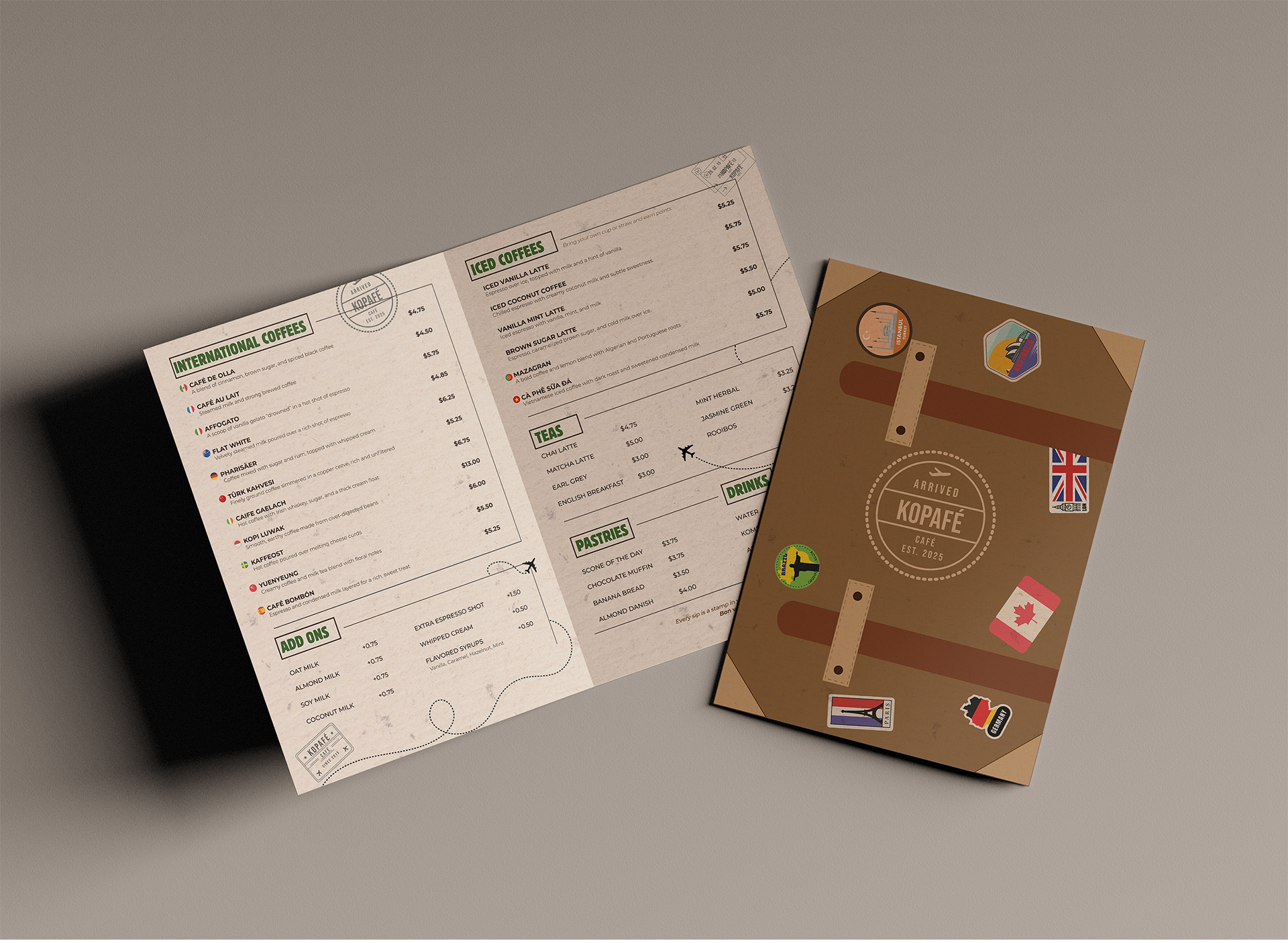
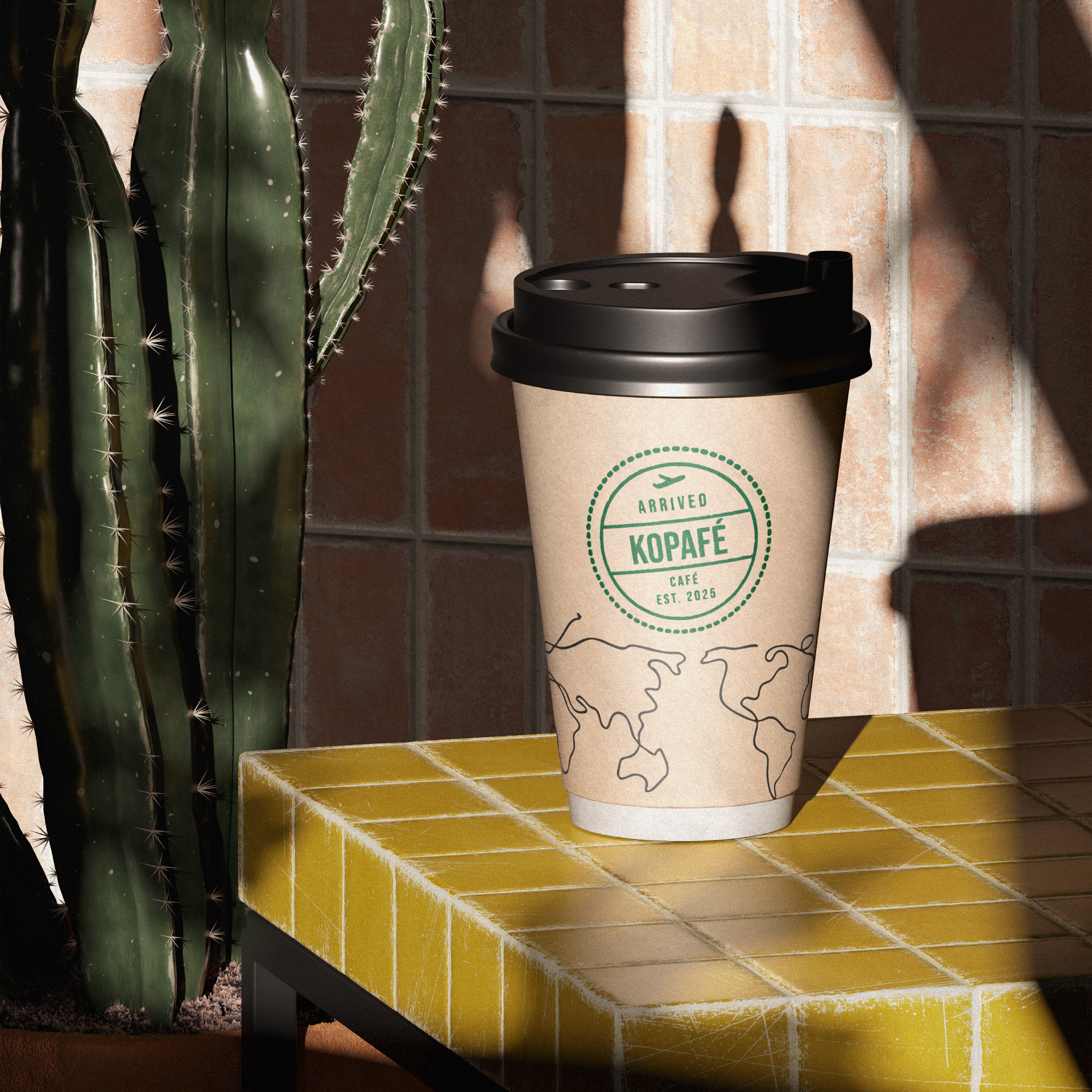
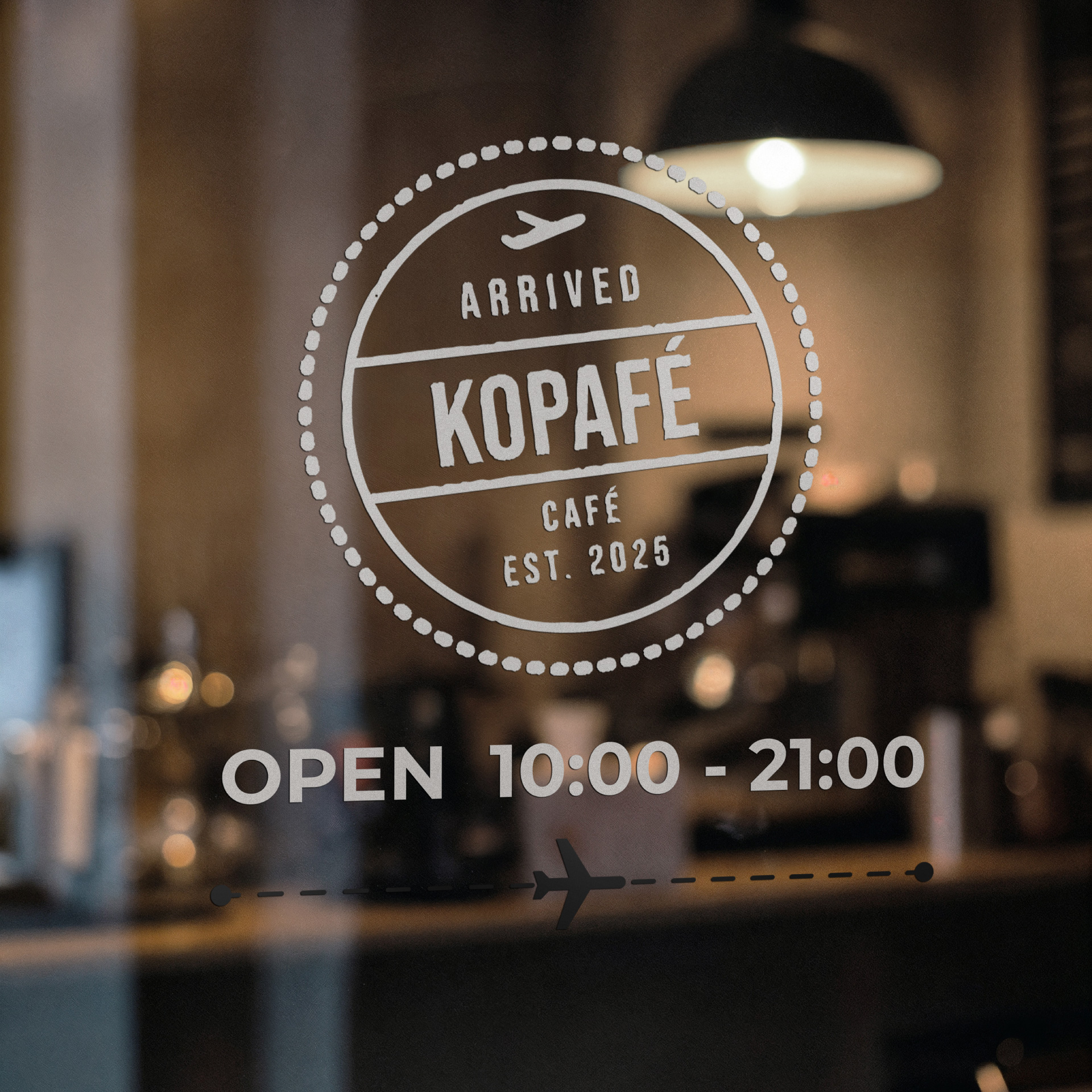
Kopafé is a branding project that reimagines coffee culture as a passport to the world. The mandate was to create a cohesive identity for a Montreal-based café offering coffee sourced from across the globe. The brand needed to feel warm, adventurous, and eco-conscious, while remaining modern and adaptable across print, digital, and packaging applications.
The process began with research into sustainable cafés, global coffee origins, and travel-inspired branding systems. I studied how visual identity could evoke a sense of wanderlust, similar to flipping through a passport. This exploration led me to the idea of turning the logo into a passport stamp, using Bebas Neue Regular for its bold, condensed form that feels both modern and nostalgic. To balance its strength, I paired it with Montserrat Light for body text, a minimalist, legible font that softens the overall tone and enhances readability across menus, ads, and digital platforms.
Symbol of growth, nature, and balance. This muted green represents Kopaf’s eco-friendly mission and its commitment to ethically sourced, sustainable coffee beans. It evokes the lush landscapes where coffee originates.
A soft, comforting neutral inspired by latte foam and sunlit mornings. It brings warmth and approachability to the brand, allowing stronger tones to stand out while maintaining a natural, organic look.
Grounded and timeless, this beige-taupe hue mirrors the earthy tones of roasted coffee grounds and wooden interiors. It balances the palette with subtle sophistication and artisan character.
Deep and rich, this color symbolizes freshly roasted beans and global coffee traditions. It conveys, warmth, depth, and craftsmanship, key traits of Kopafé’s personality.
Dark, bold, and grounding, this espresso tone adds contrast and strength. Used for text and accents, it anchors the palette and enhances the visual richness of Kopafé’s identity.
The menu was designed in the shape of a suitcase, inviting customers to “pack their bags” and explore Kopafé’s global coffee selection. Each section of the menu represents a different region, from South America to Africa to Asia, giving the impression of flipping through travel destinations rather than drink options. Typography and layout work together to immerse customers in the feeling of traveling the world one cup at a time, transforming a simple menu into a journey of discovery and flavour.
For Kopafé’s redesigned packaging, I chose a recyclable and reusable aluminum tin canister that reflects the brand’s sustainable and premium identity. Aluminum is lightweight, durable, and preserves coffee freshness by protecting it from air, light, and humidity. Its bronze finish complements Kopafé’s earthy color palette, while the stamp-shaped lid subtly reinforces the travel theme and offers a comfortable, ergonomic grip. Although aluminum has a higher initial cost than paper or plastic, its reusability and recyclability make it a long-term eco-friendly investment, saving up to 95% of the energy required for new production. This design replaces single-use packaging with a refillable, sustainable solution that aligns with Kopafé’s mission to promote conscious consumption and create meaningful, lasting customer connections.
Kopafé’s typography was chosen to express the brand’s global, travel-inspired spirit while maintaining warmth and readability across print, digital, and packaging. The primary font, Bebas Neue Regular, defines the logo and main headings with its bold, condensed, all-caps form reminiscent of passport stamps and airport signage. It conveys confidence, clarity, and modern simplicity, perfectly aligning with Kopafé’s adventurous personality.
To balance its boldness, Montserrat serves as the secondary typeface for subheadings and body text. Its rounded shapes and open structure add a sense of approachability and sophistication, creating a welcoming tone throughout menus, ads, and digital layouts. Montserrat Light is often used for descriptions, while Montserrat Bold highlights coffee names or countries of origin, ensuring clear hierarchy.
For select details, such as the plane-ticket business card, DIN Condensed adds a utilitarian, travel-document feel that subtly reinforces Kopafé’s wanderlust identity. Together, these typefaces create a cohesive and timeless system, blending structure with warmth, just like the perfect cup of coffee.

